FlooringStores
Case StudyHelping users understand flooring products and services
The Services
View All
The Mission
Create a brand from the ground up - including logo, wordmark, color palette, font-pairing, style guide and design system. Design the future of online flooring experiences, for both mobile and desktop customers.
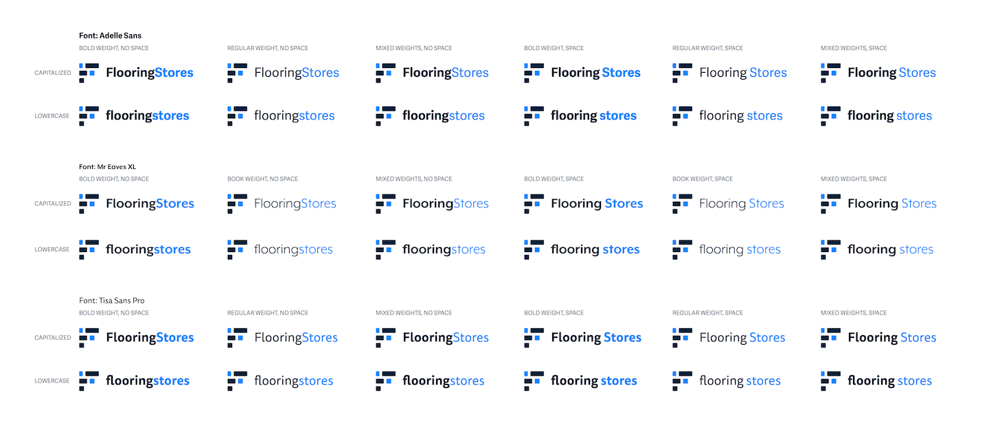
In styling the wordmark, we tested numerous combinations of font-family, font-weight, text-transform, and spacing. Ultimately, we chose "Adelle-Sans", regular weight, no space, capitalized.

Banner design for FlooringStores' social media profiles
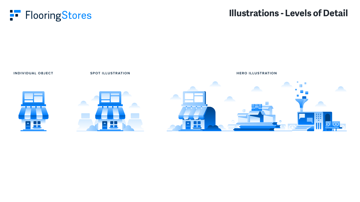

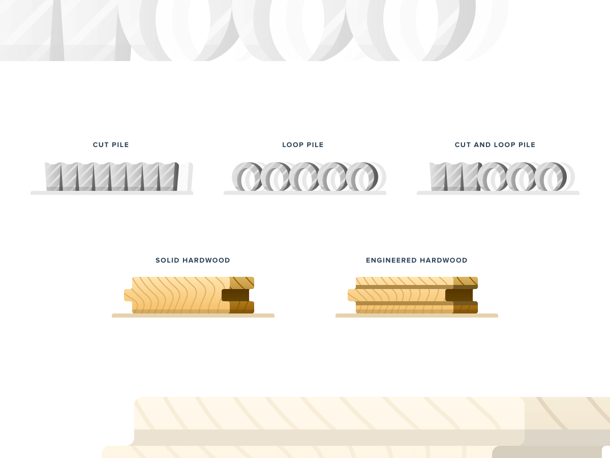
Examples of both monochromatic and full-color illustration styles.
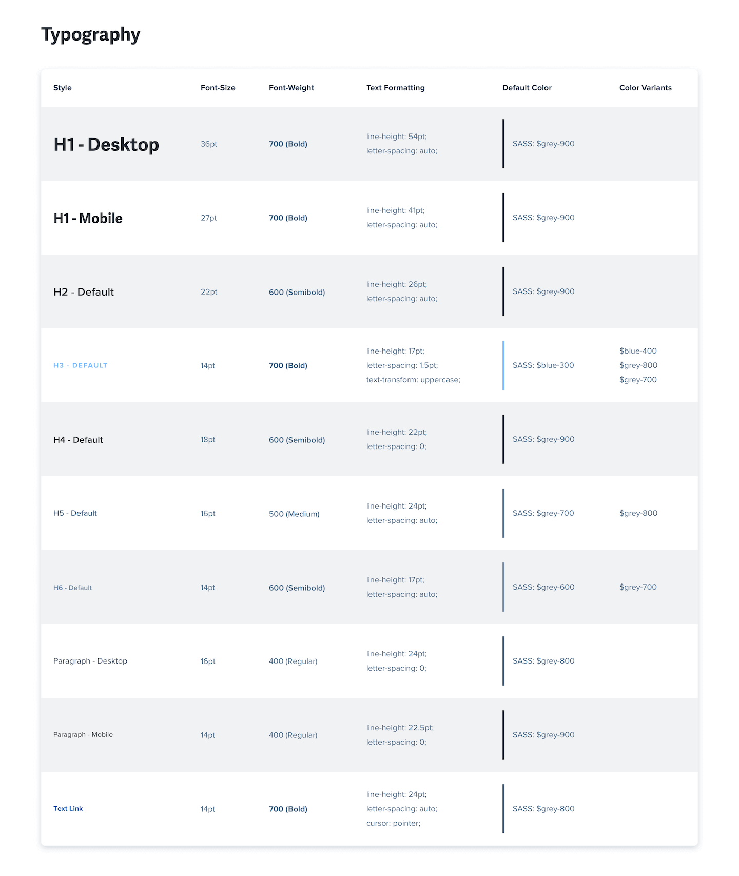
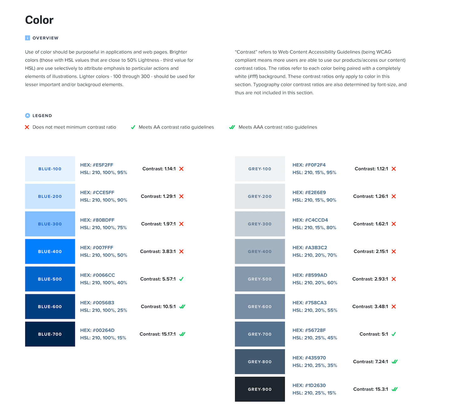
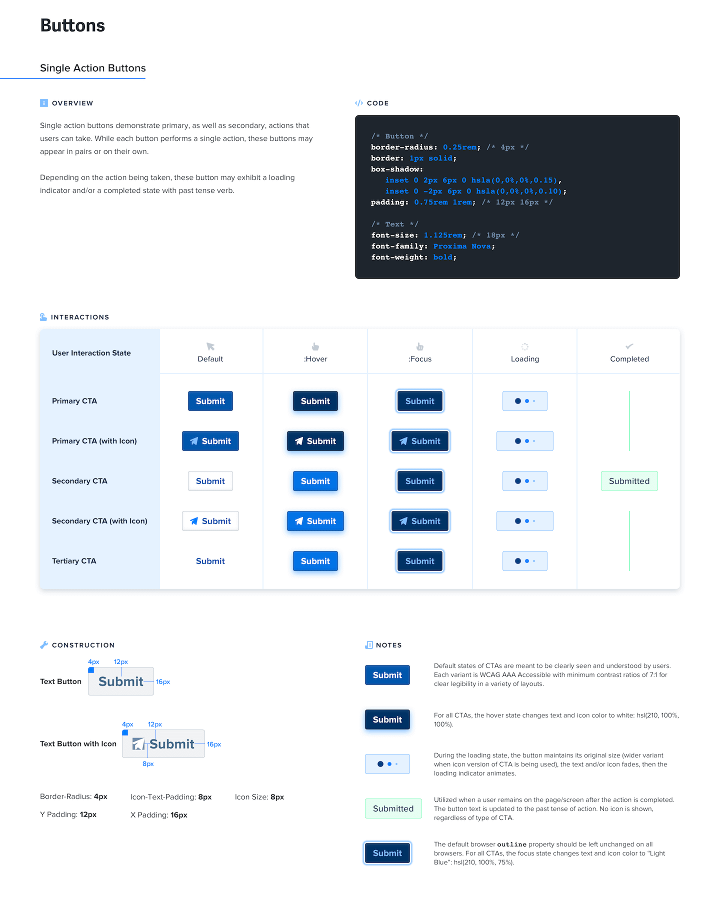
Design system components that ensured proper implementation of FlooringStores brand
The Challenge
Currently, there are a number of places where users might be able to find flooring options for their home. However, many of these offerings - especially in online contexts - feature outdated and confusing user interfaces, thus resulting in diminished user experiences.
With the flooring industry expected to reach $472.6 Billion by 2024, the focus for FlooringStores.com is to make the user experience of researching and finding flooring the very best it can be. In order to do so, we focused heavily on clean design and accessible color palettes, so that the product can be best experienced by as many users as possible.
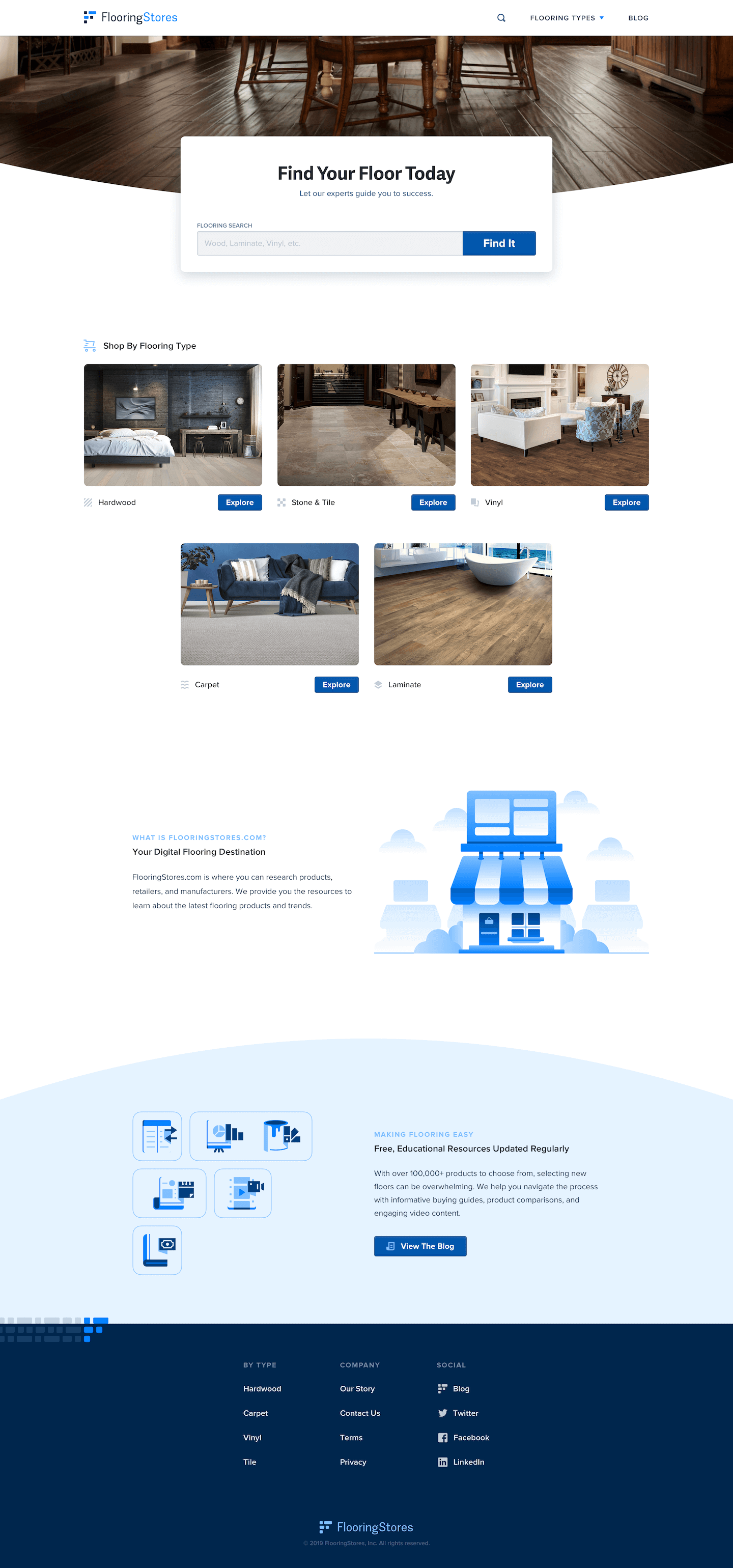
FlooringStores.com home page


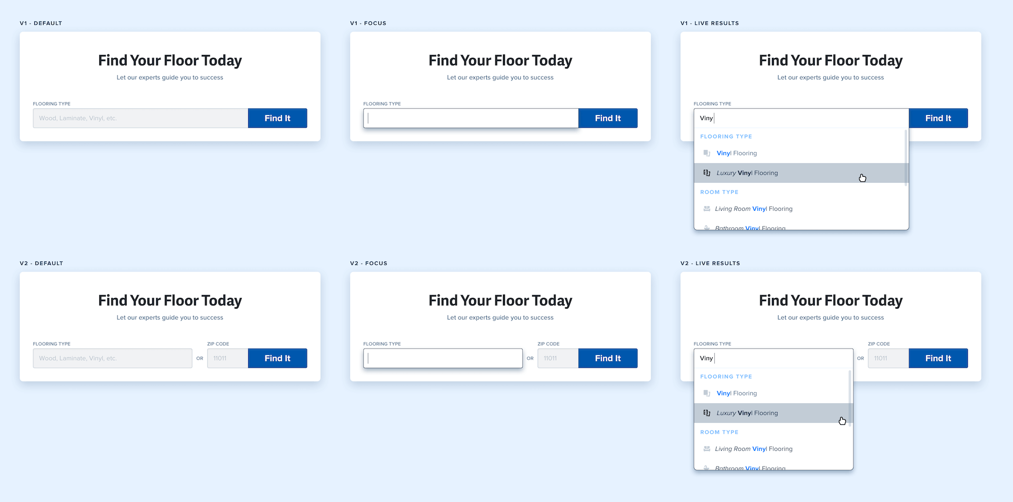
Search Field Versions and Interaction States
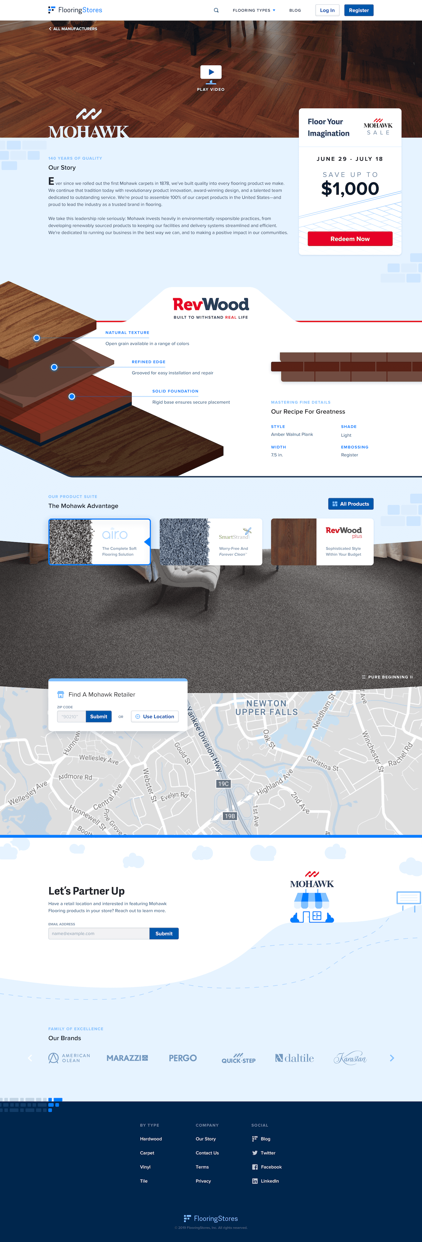
Manufacturer page
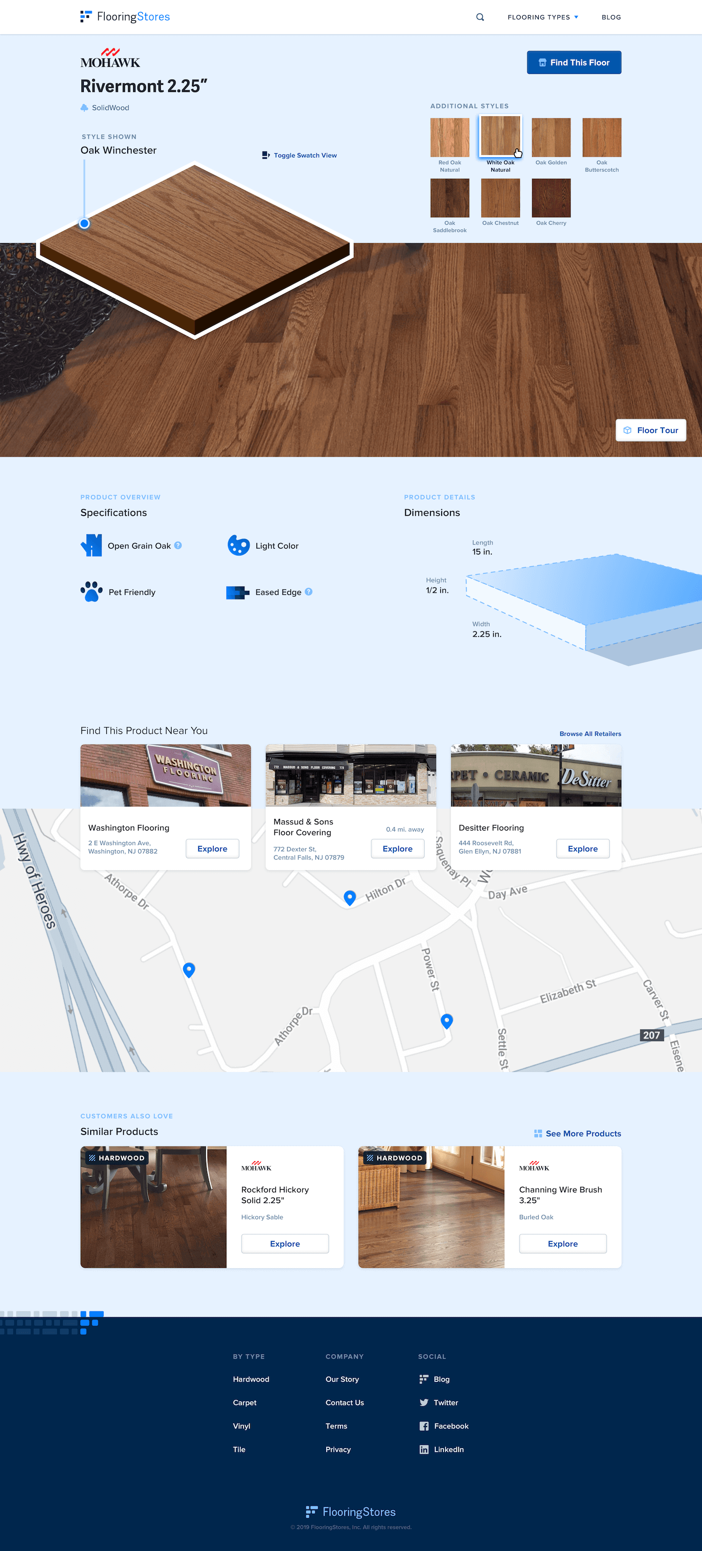
Product detail page
The Result
We designed a number of different elements for FlooringStores.com, including the Branding, UI Design System, B2C Progressive Web Application (PWA), B2B app RetailerHub, Print materials and Blog. We worked with developers and tested iterations of the application usage with FullStory, adjusting elements based on usage (or lack thereof) to ensure the best user experience.
