AdHawk
Case StudyDesigning applications to simplify SMBs digital advertising
The Services
View All
The Client
Founded by two former Google Ads ("Google AdWords" at the time) employees in 2015, AdHawk is an adtech startup aimed at simplifying digital advertising. Specializing in Google and Facebook Ads, they create software solutions to help small and medium-sized businesses optimize ad campaigns.
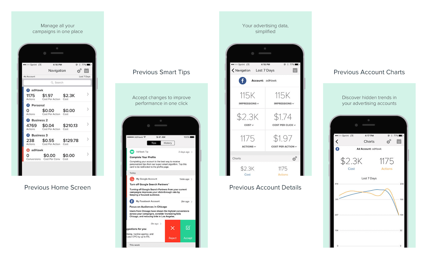
The previous design of the AdHawk iOS app.
The Product
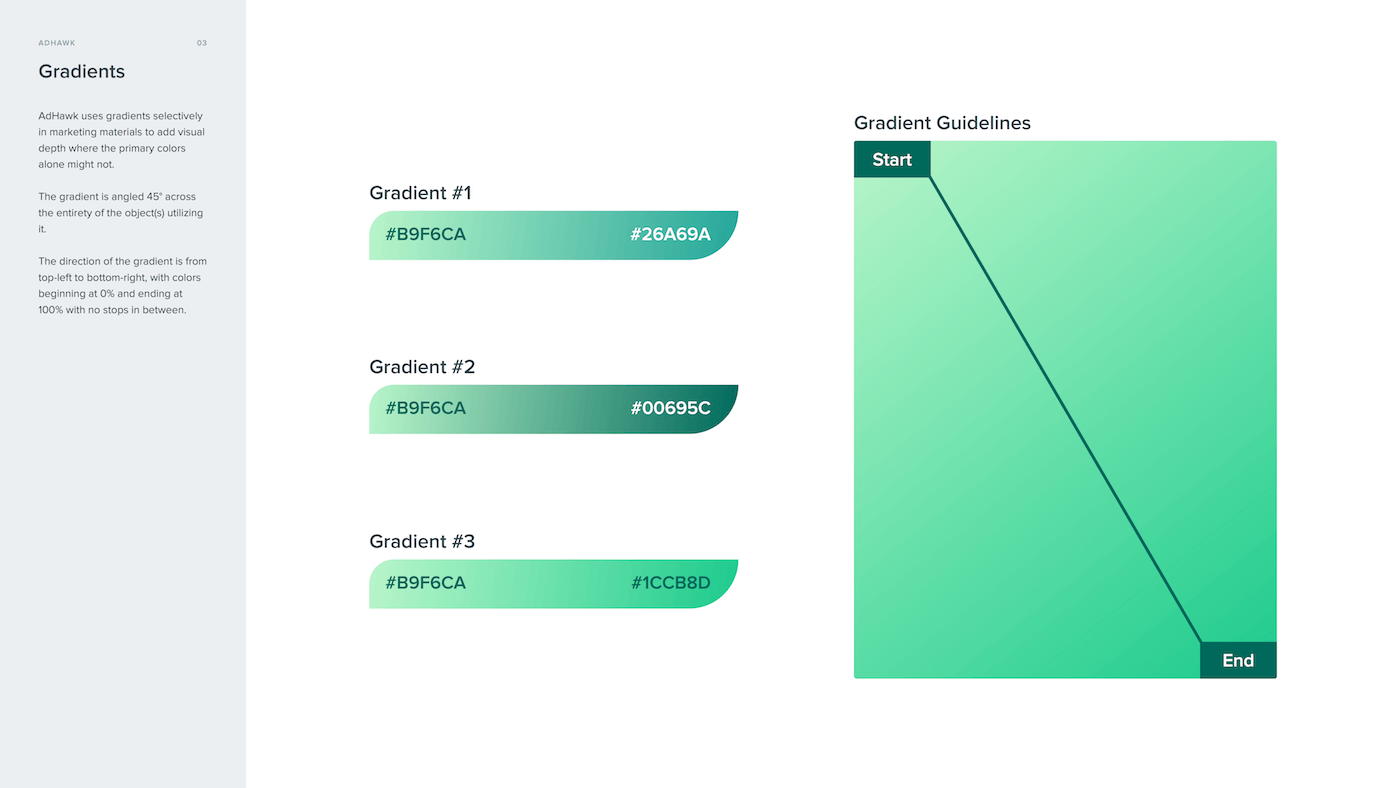
The first task was re-designing the AdHawk iOS App. The previous app had most of the functionality desired by users, but fell short in several areas. It was visually rather flat, with an inconsistent visual hierarchy. Elements of the app were too small for touch screen interactions, resulting users having to go back or cancel out of options they didn't want to select. Additionally, it lacked a true sense of the AdHawk branding. Finally, the components created for the app were not very modular, which made designing and implementing additional features especially challenging.
We began our re-design where the users begin their experience - the signup/login screen. We wanted these screens to be as welcoming and informative as possible, while also setting the tone for the AdHawk brand with which users would interact during their time in the app. We ensured that contrast ratios were accessible and that touch targets were large enough to prevent accidental taps. We contextualized the login progress by turning the "Log In" button to "Logging In", along with a loading animation to inform users.
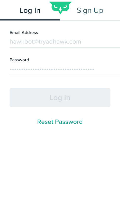
Empty state of "Log In" screen
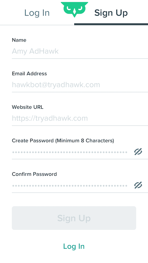
Empty state of "Sign Up" screen
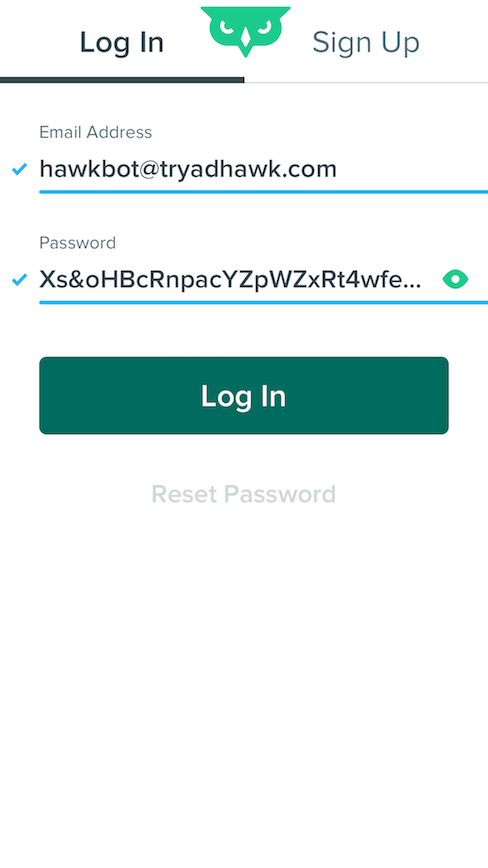
Completed state of "Log In" screen
Password field shown.
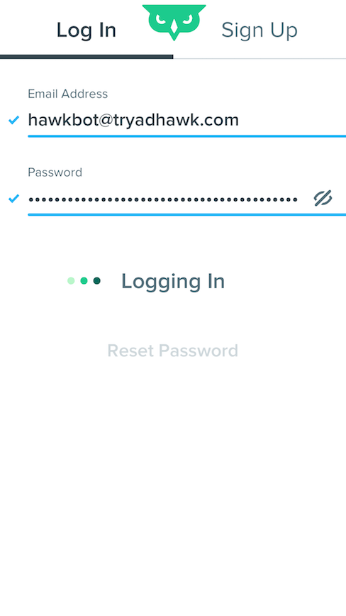
Completed state of "Log In" screen
"Log In" button shows loading text.
The Onboarding
Once users had first signed into the app, we knew that they were going to need to complete additional steps to get the most out of their experience. As such, the initial view provides a visual empty state that informs them they should connect their ad accounts. We guided their decisions by offering only two items in the tab bar during initial setup. This way, they can see settings, along with the home screen, but cannot take additional actions as the app only functions when at least one ad account has been connected.
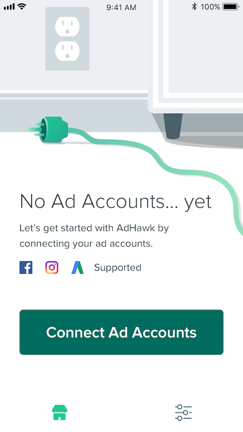
Home (Empty State)
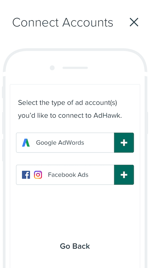
Connect Accounts
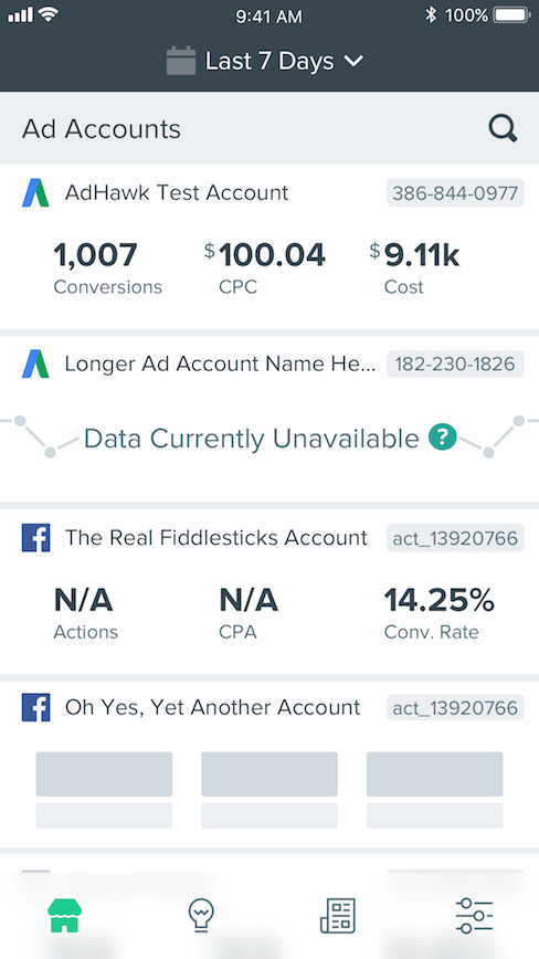
Home (Accounted Connected)
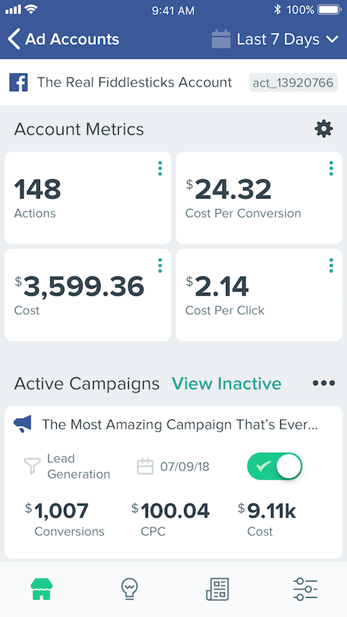
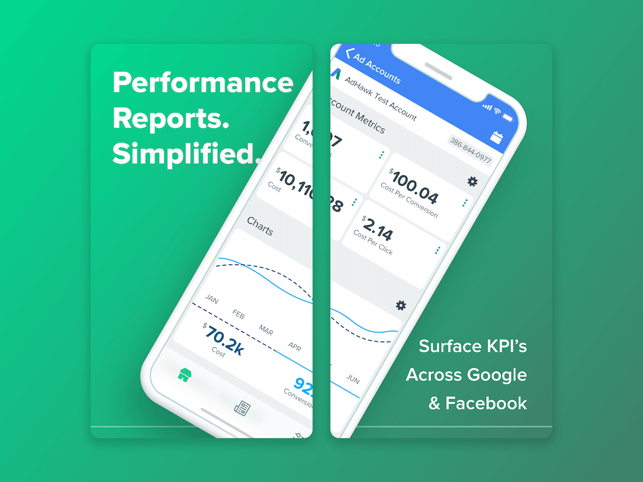
Facebook Ads Account Details
The Features
The core goal of the AdHawk iOS app is to empower users to easily manage their ad accounts, easily viewing insights into how they can improve their ad campaigns. By re-designing the components themselves to be modular, we're able to accomplish this goal in a way that is scalable. The re-designed application features a component library that can be added to in future versions, without comprising AdHawk's mission statement: "Simplifying digital advertising".
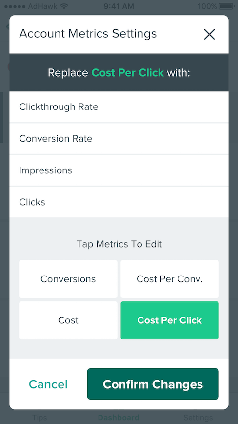
Account Settings Modal
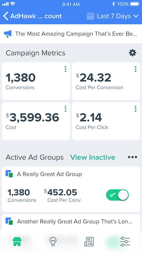
Google Ads Account Detail
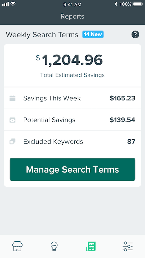
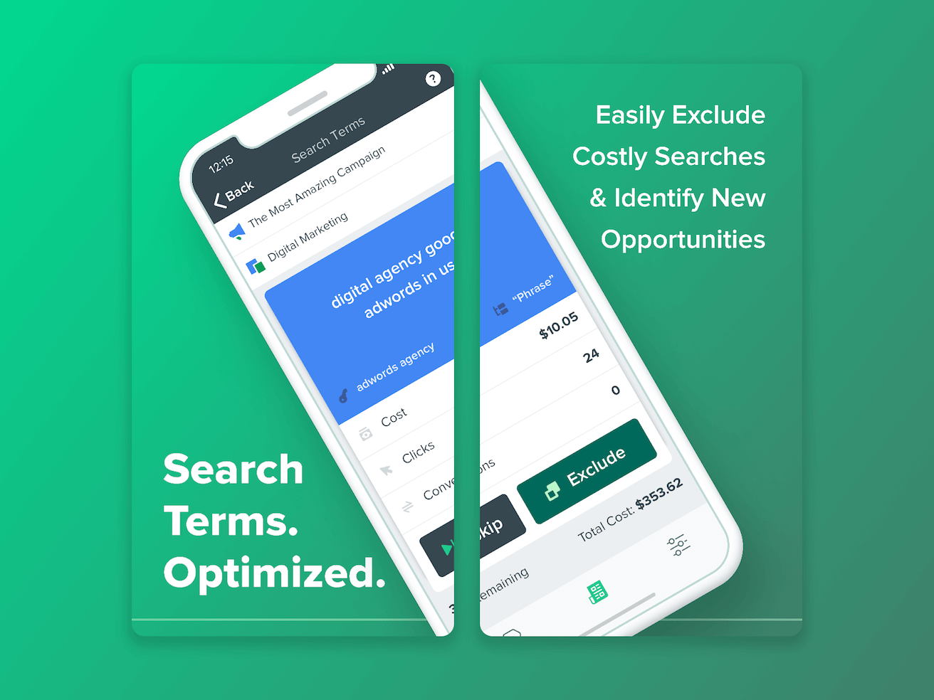
Search Terms Report
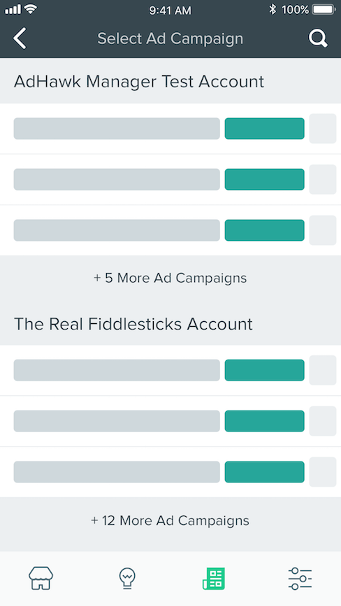
Ad Campaigns (Loading)
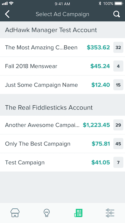
Search Terms Ad Campaigns List
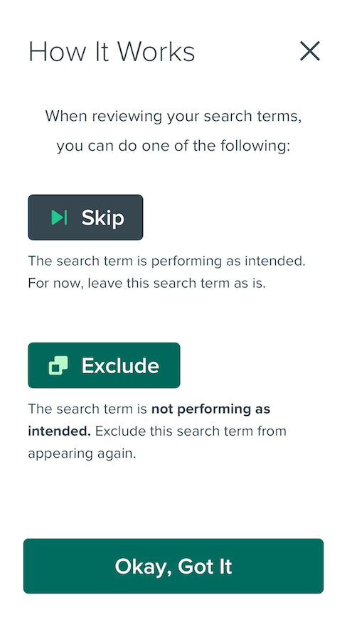
How Search Terms Work
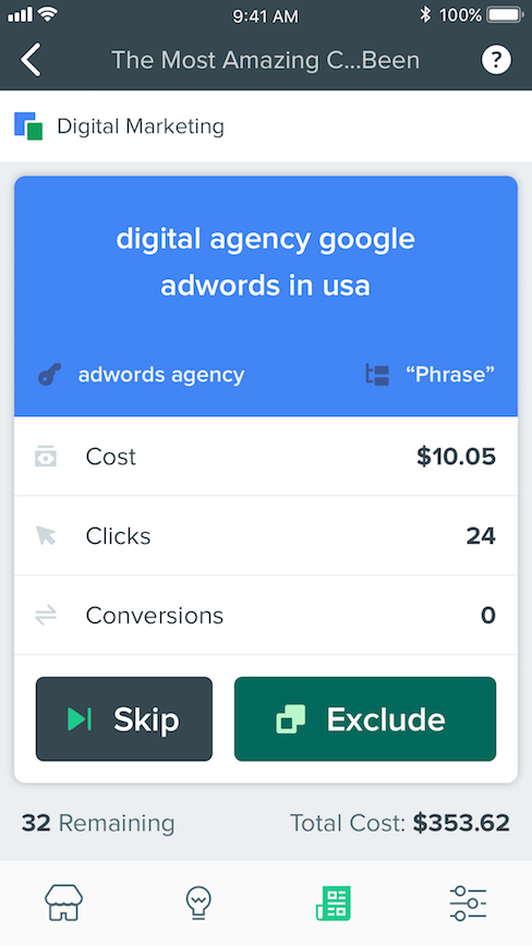
Search Terms Card
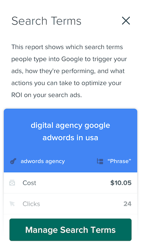
Search Terms Card (Info Modal)
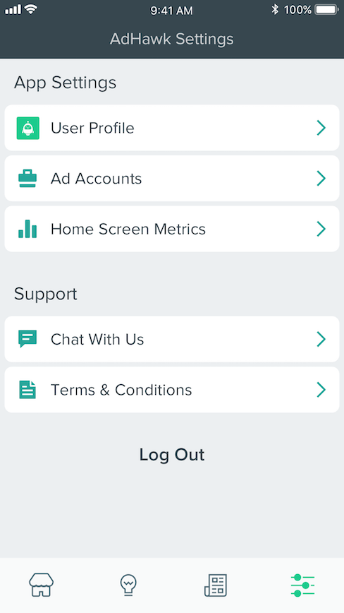
AdHawk Settings
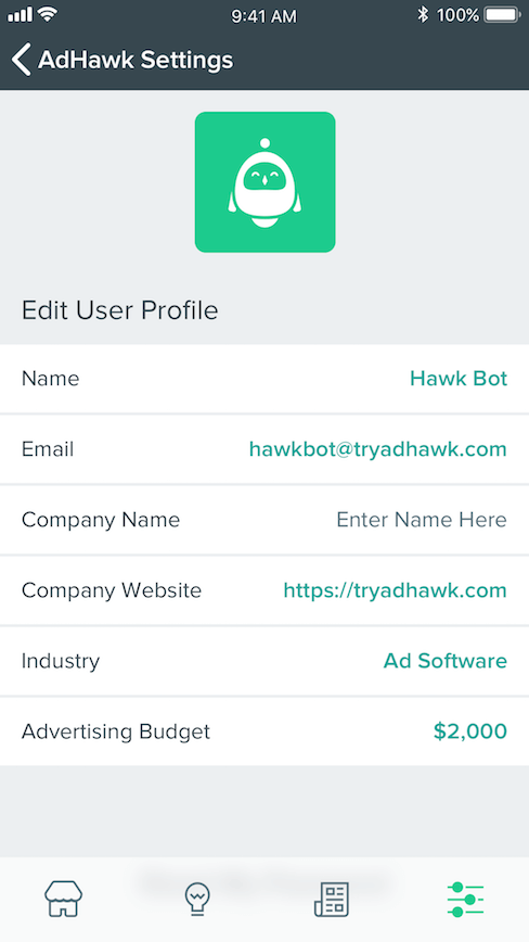
User Profile Settings
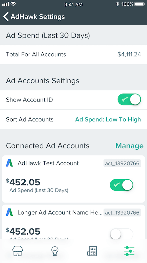
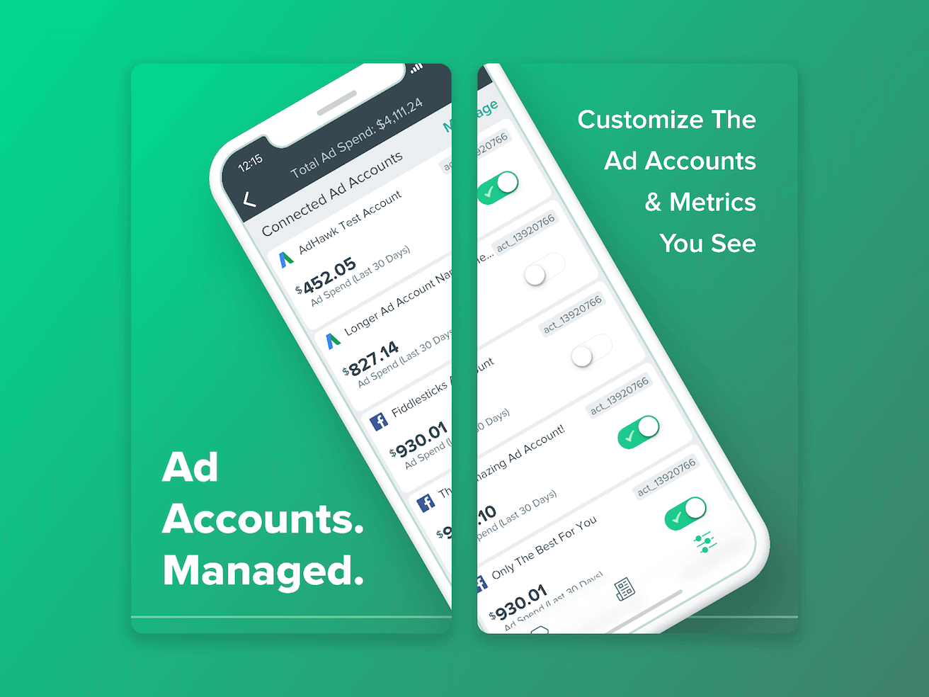
Ad Accounts Settings
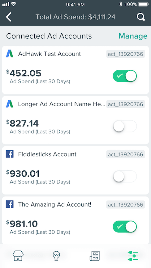
Ad Accounts Settings (Scrolled)
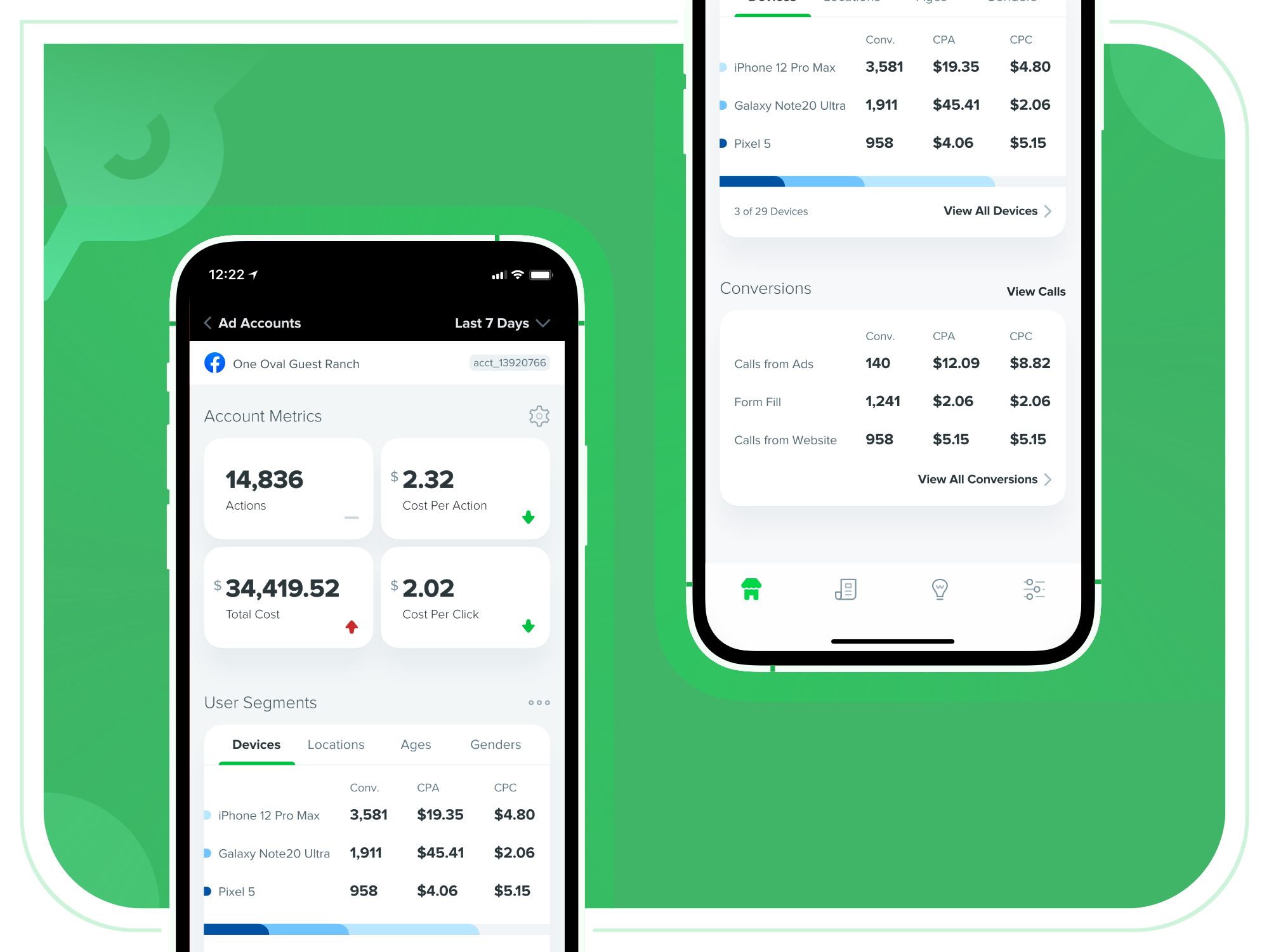
Stylized Presentation of Facebook Ads Account Overview UI
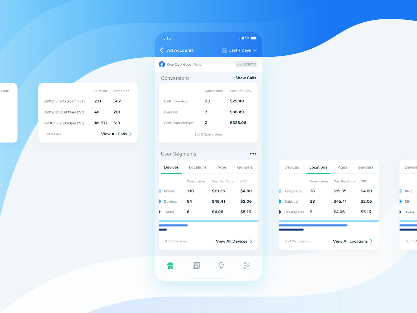
Stylized Presentation of modular card components
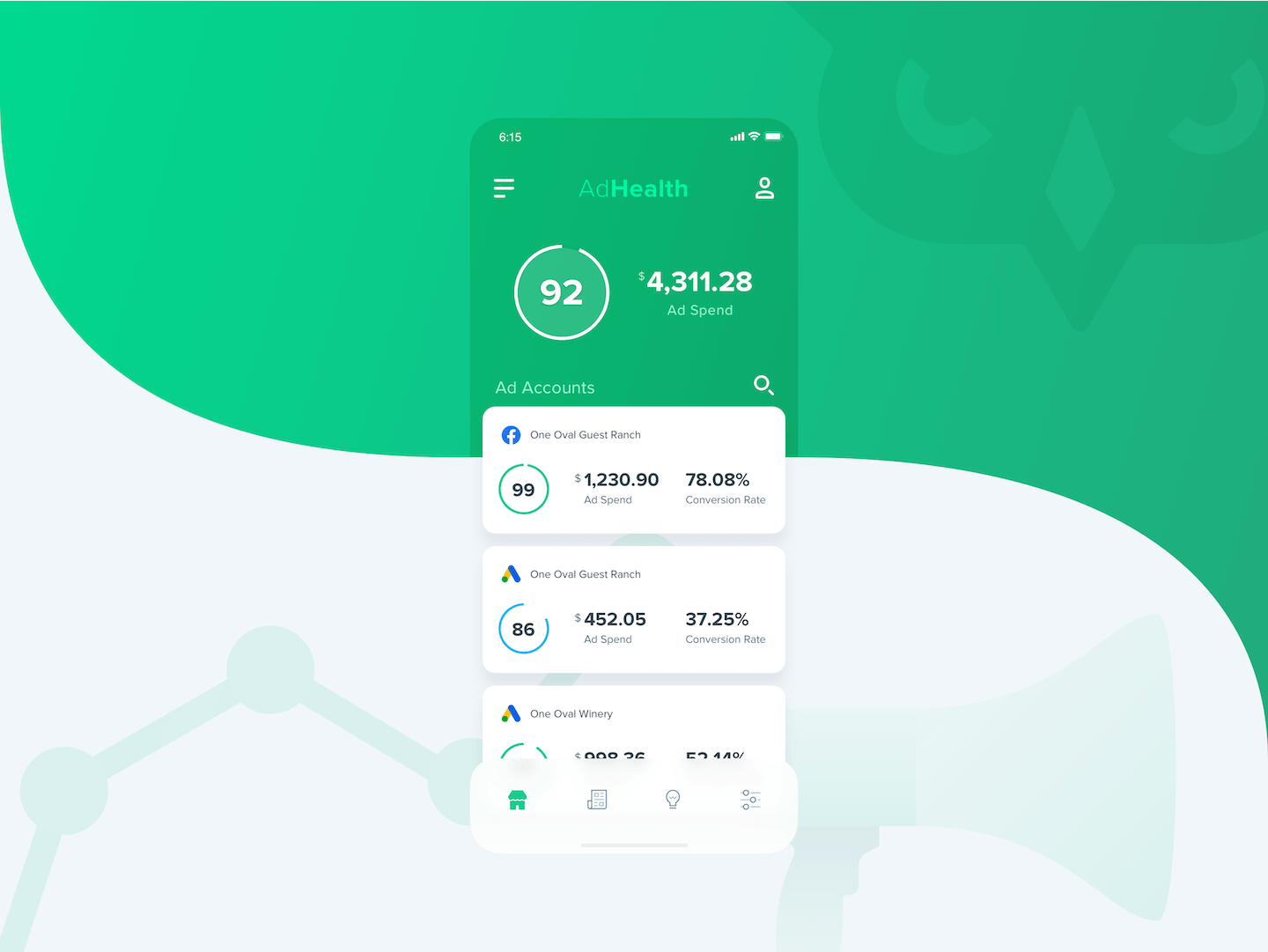
Stylized Presentation of AdHealth feature concept
The Launch
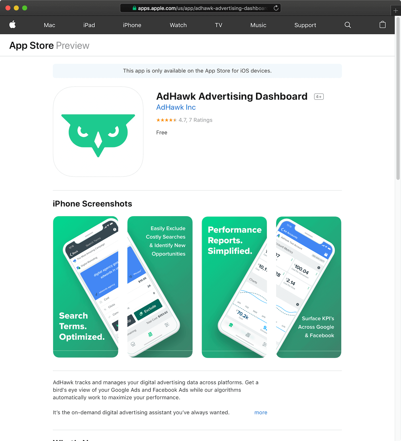
After working with the iOS developers at AdHawk, through numerous rounds of design reviews and app testing, we launched the app in the Apple App Store. While AdHawk's user base is not huge, the reception has certainly been positive. Since the re-designed app was launched, it has maintained a 4.7 Star rating from users, showing our work is appreciated.
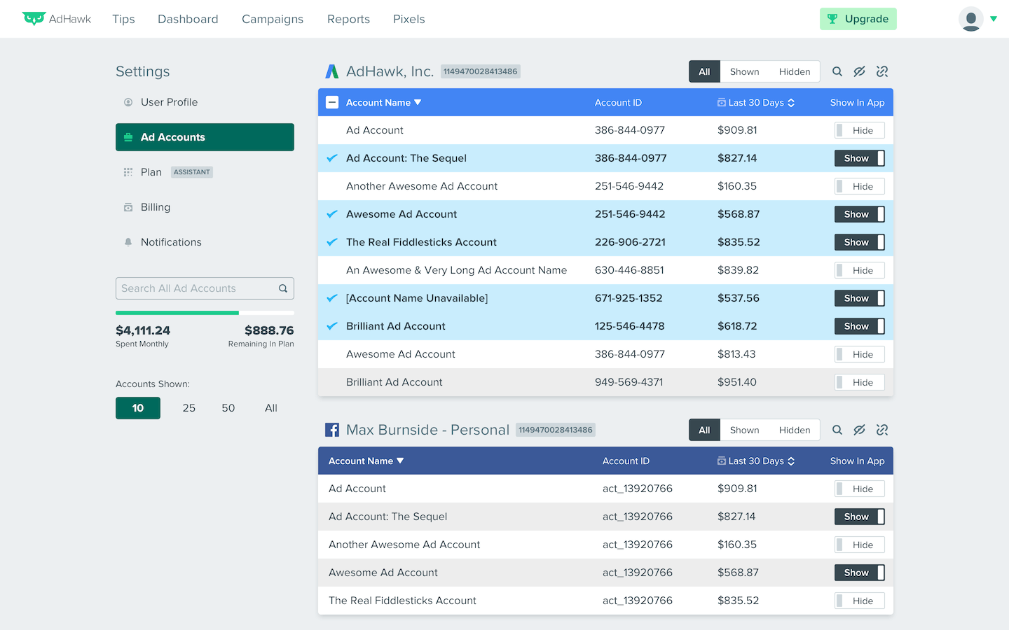
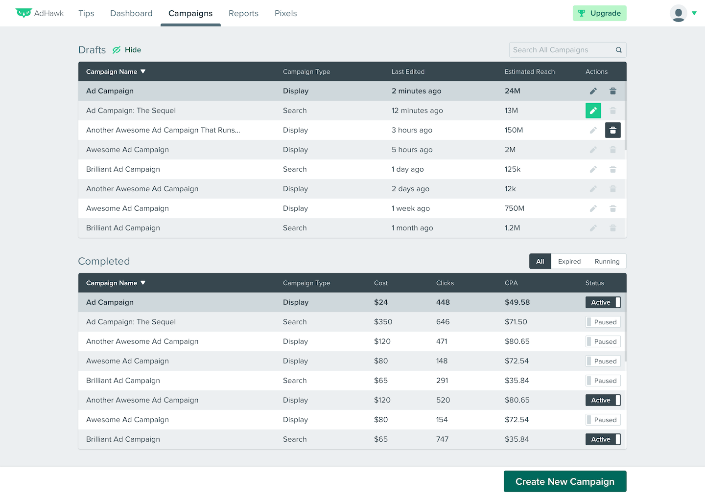
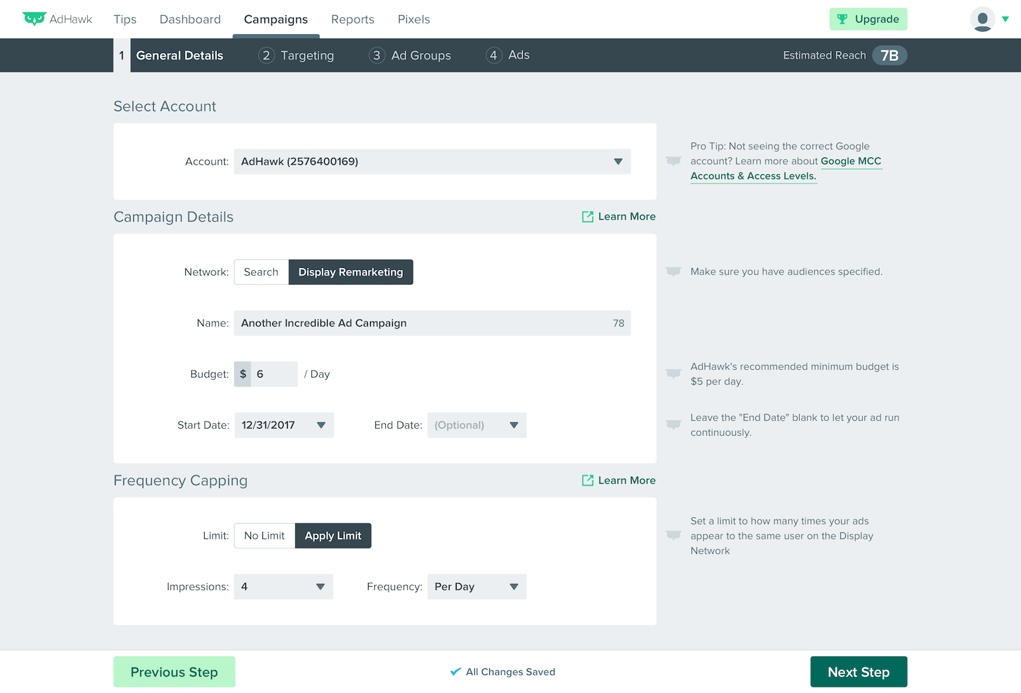
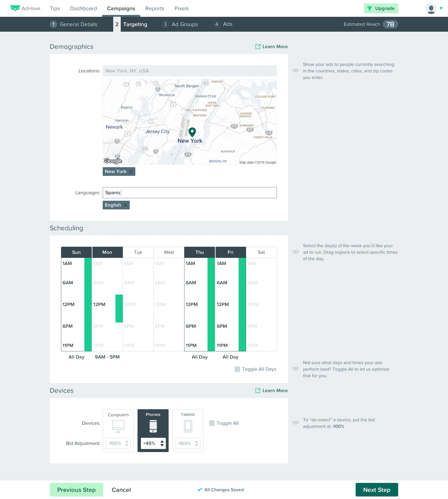
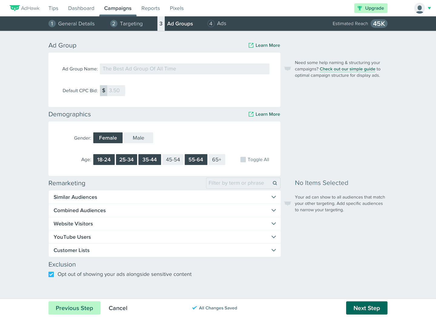
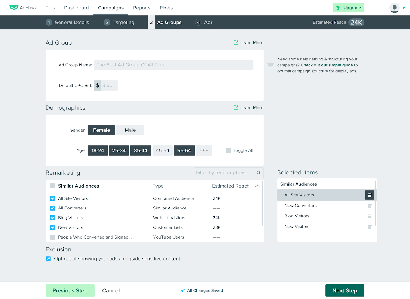
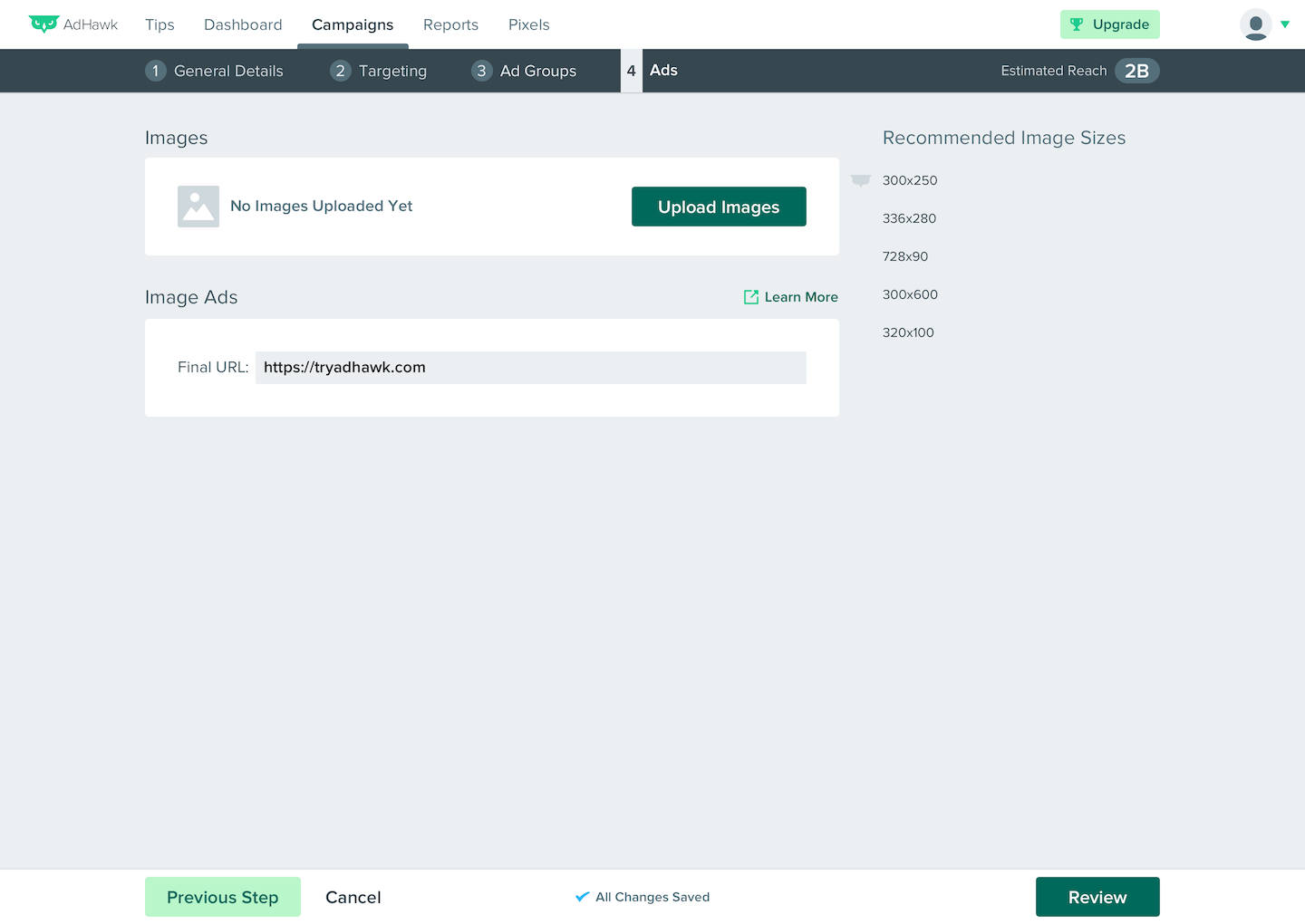
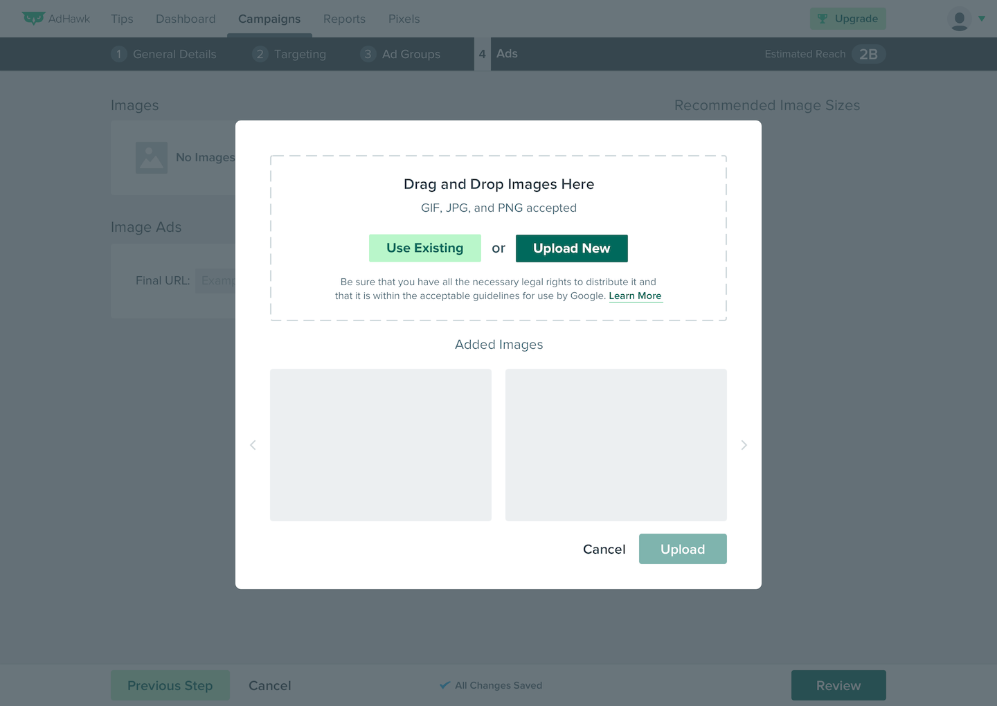
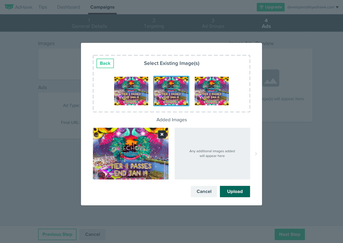
Desktop AdHawk Web Application - Ad Accounts Settings
