AnchorPint
Case StudyCrafting an immersive, distance-learning platform for designers
The Services
View All
The Client
AnchorPint was an internal project at Burnside Agency. As our own "client", we had the goal of combining design education, inspiration and resource access. Founded in 2015 and publicly launched in early 2016, AnchorPint featured daily educational content - both in video and written formats.
Originally named "No Design", it was aimed at helping non-designers learn techniques to help them with digital product creation. After further planning, we decided to focus more on helping mid-level designers learn tips and tricks that they might not otherwise know, using the design software they already love. With this renewed focus came the idea of naming it "AnchorPint" as a take on "anchor point(s)", which are the building blocks of vector designs, and making it fun, with "pint" as a beer reference for not being too serious about things.
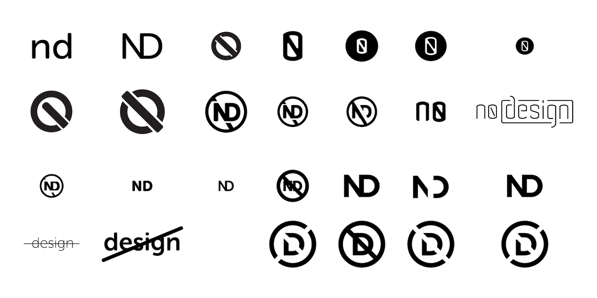
Initial designs for "No Design" logo and wordmark
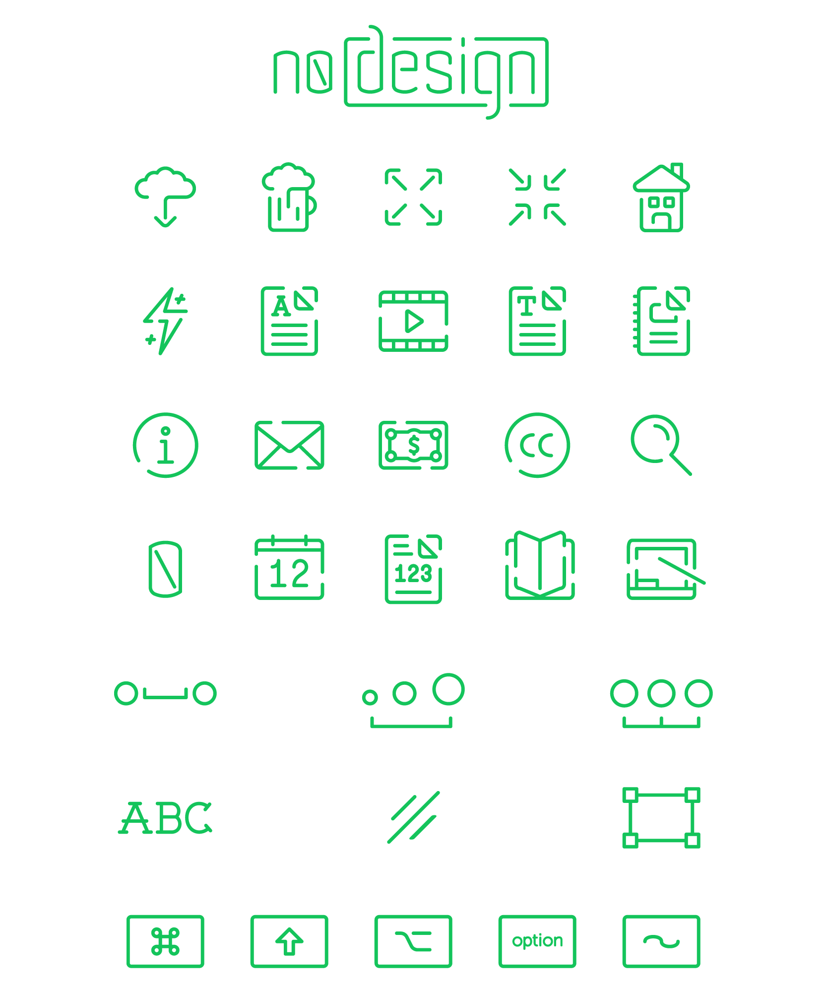
Icons designed when the project was titled "No Design"
The Wordmark
After deciding on "AnchorPint" as the name, we worked through a number of different logo and wordmark variations. Branding efforts are always unique to the project and for AnchorPint, it became clear early on that the name itself should shine as the logo. "AP", "A", or an icon just wouldn't have the same appeal to or traction with users. As such, much time was spent refining the wordmark. A selection of some iterations (from the nearly 100 in total) can be seen below.
When crafting the wordmark, we challenged ourselves to combine slab and sans-serif treatments. The site itself would be at the forefront of design techniques and content (representing the sans-serif), the brand itself still needed to have a classic feel (the slab-serif side of the equation). To achieve this balance, we hand created and kerned the lettering, adding slab-serifs to the top portion of the letters. The slabs are selectively placed to provide a dynamic wordmark, that has a sense of movement forward due to the placement of the serif typically on the top left.
The combination of slab and sans-serif, along with the slightly rounded edges of the wordmark have an approachable yet authoritative feeling. We wanted to establish a brand that was accessible, as we were fostering design learning, while also representing the knowledge base and expertise that users could expect during their interactions .
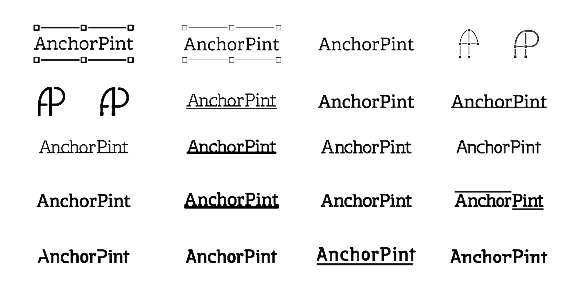
Iterations of logo and wordmark designs for "AnchorPint"

Evolution of the AnchorPint wordmark
The finalized wordmark, shown with background visual elements
The Brand
A great brand extends far beyond a wordmark and/or logo. In building AnchorPint, we needed to create a foundation of icons, font-pairing, a color palette, visual elements, and more. Included below are examples of how we fully fleshed out the remaining elements of AnchorPint branding.
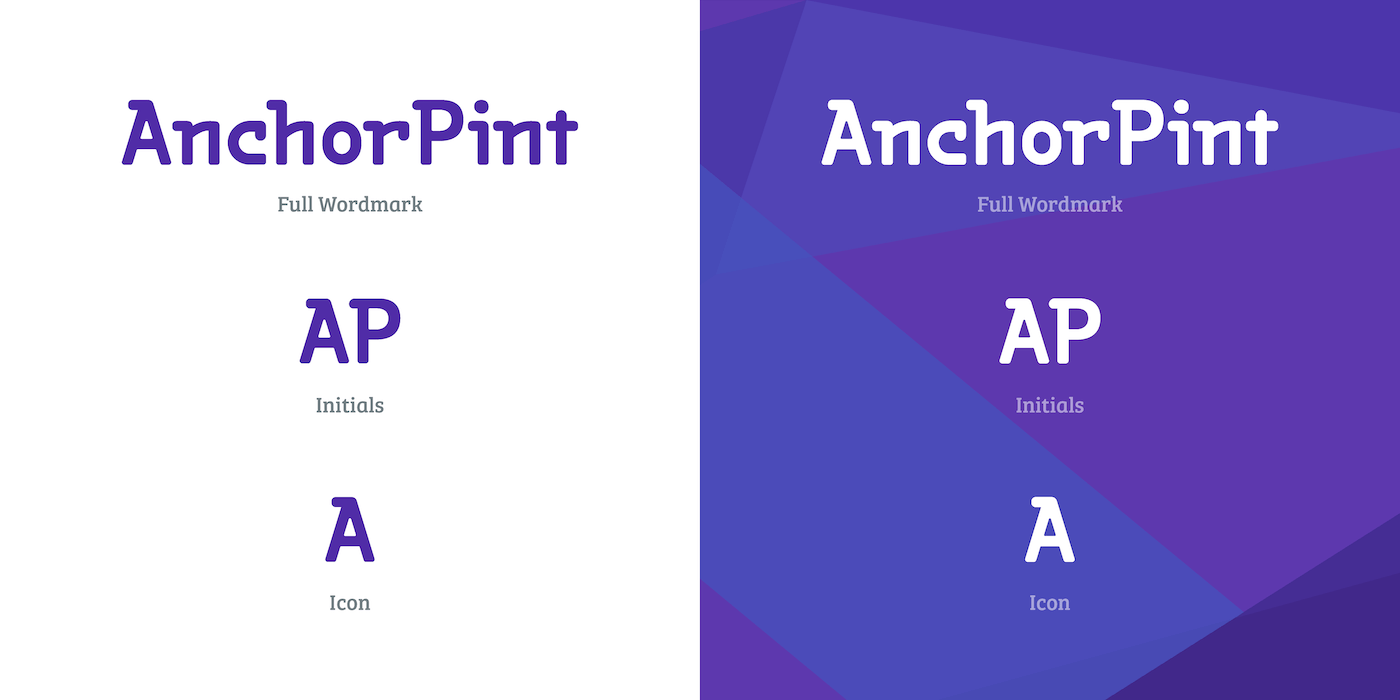
A variety of wordmark and logo versions for both white and dark backgrounds allows the brand to be present across many platforms/screen sizes.
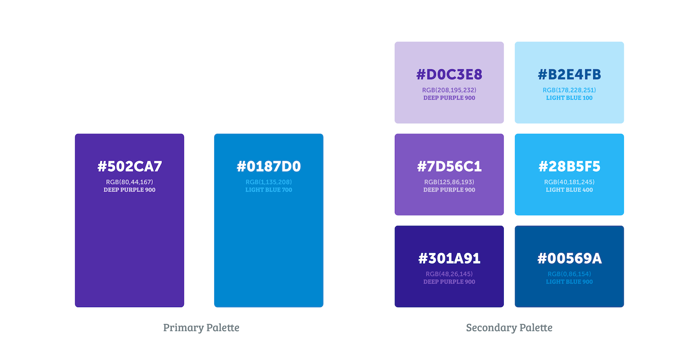
A clearly defined color palette made it easier to create consistency when making content as well as illustrating visual elements for design tutorials.
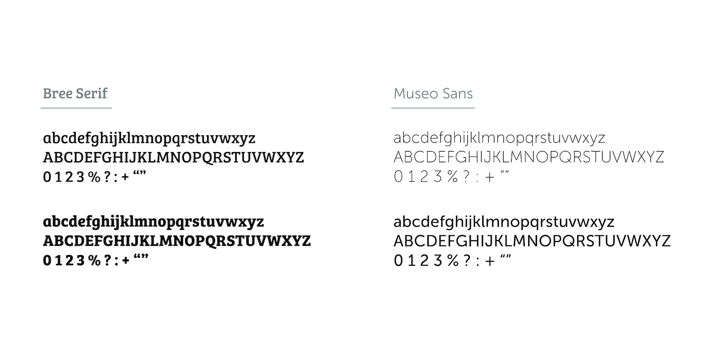
Again utilizing the AnchorPint wordmark blend of slab and sans-serif, we used both font types to display content dynamically
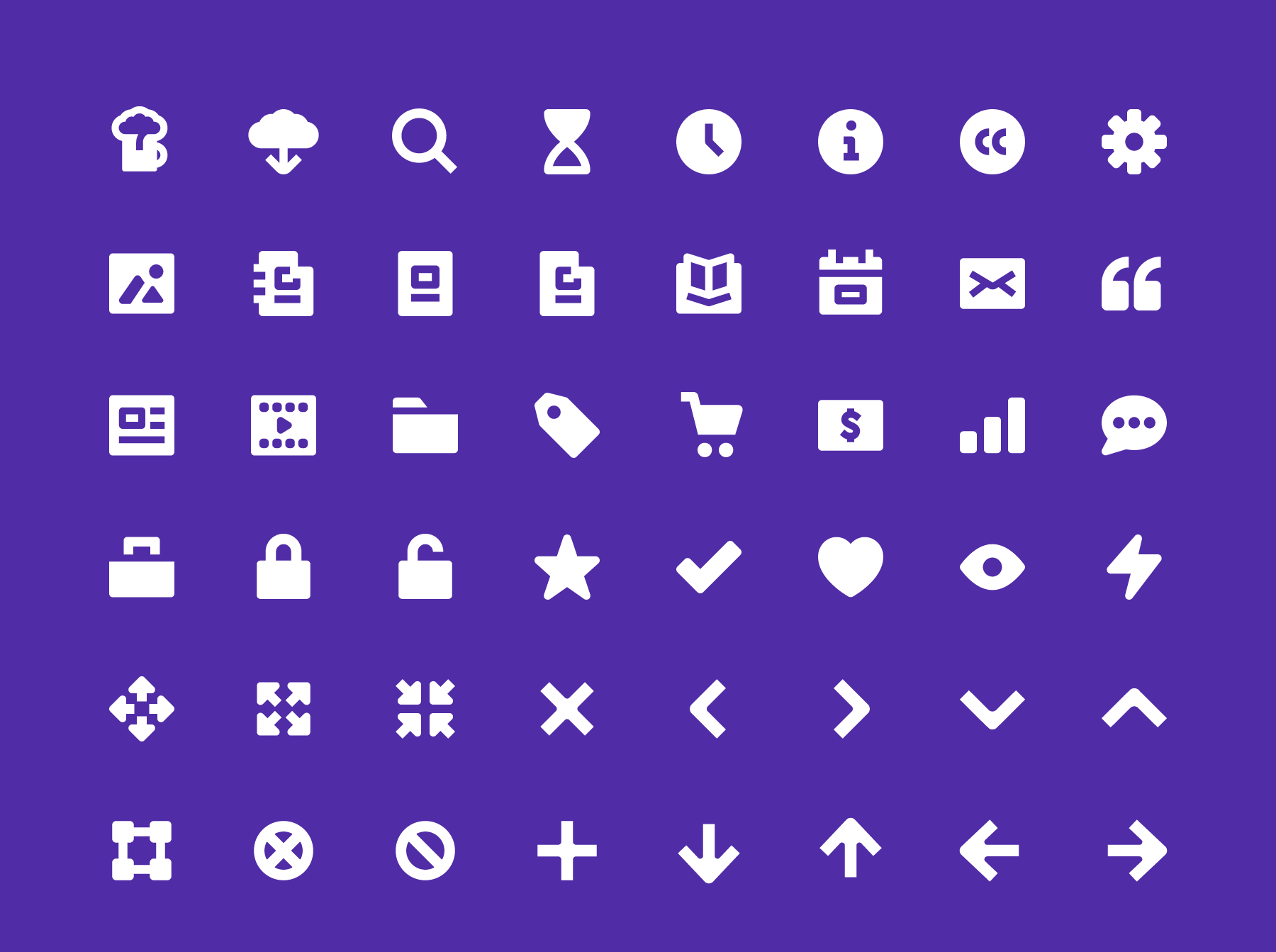
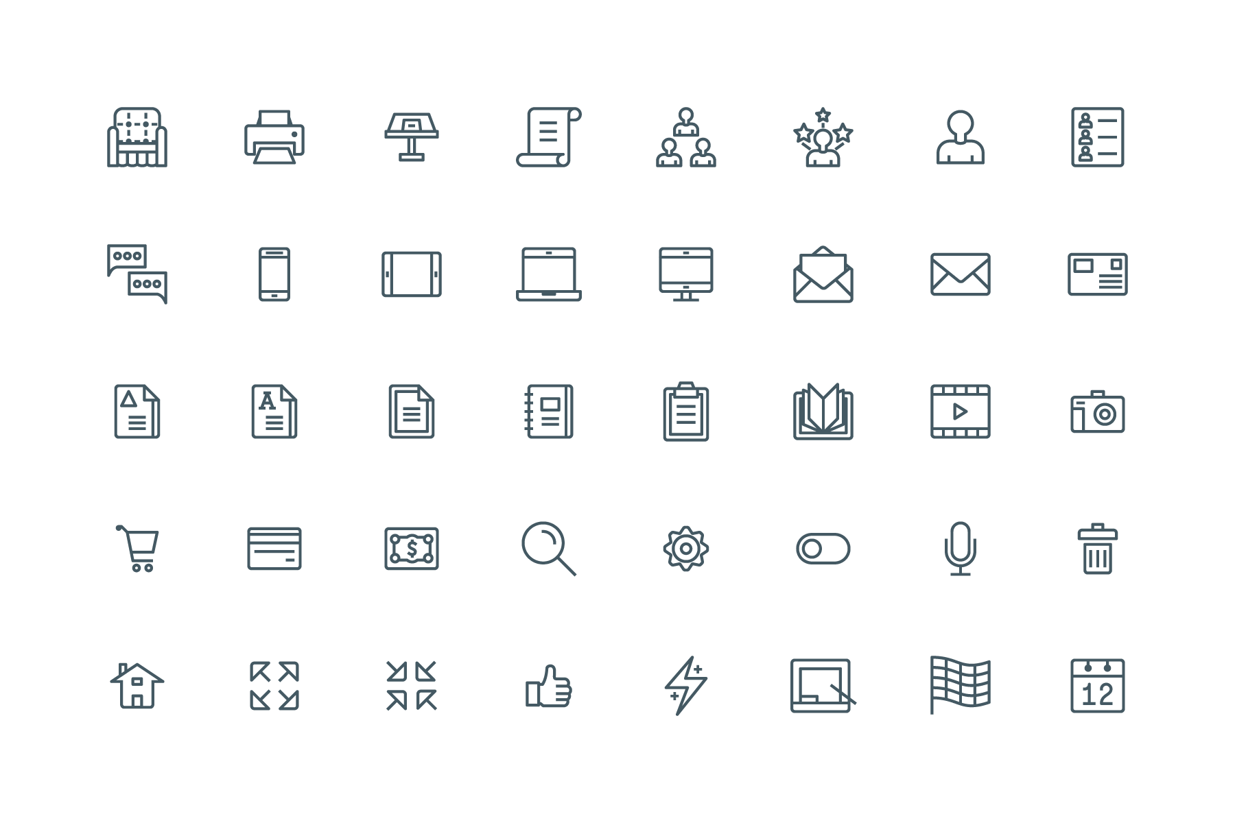
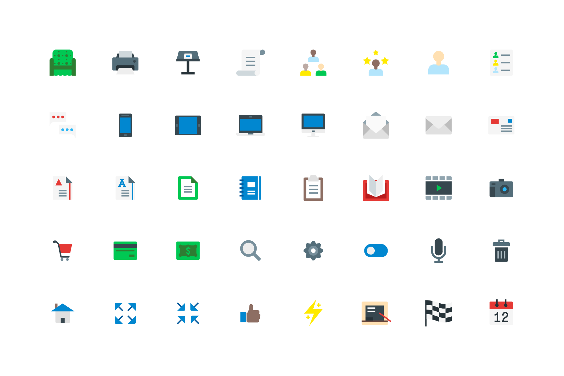
Custom created SVG icons for AnchorPint, which were utilized on the website and in the online store
The Product
Notable design elements include a tab filtering section to help users easily select sections of material, dynamic font resizing suited for all devices, easily accessible "thumb-friendly" location of buttons when viewed on mobile.
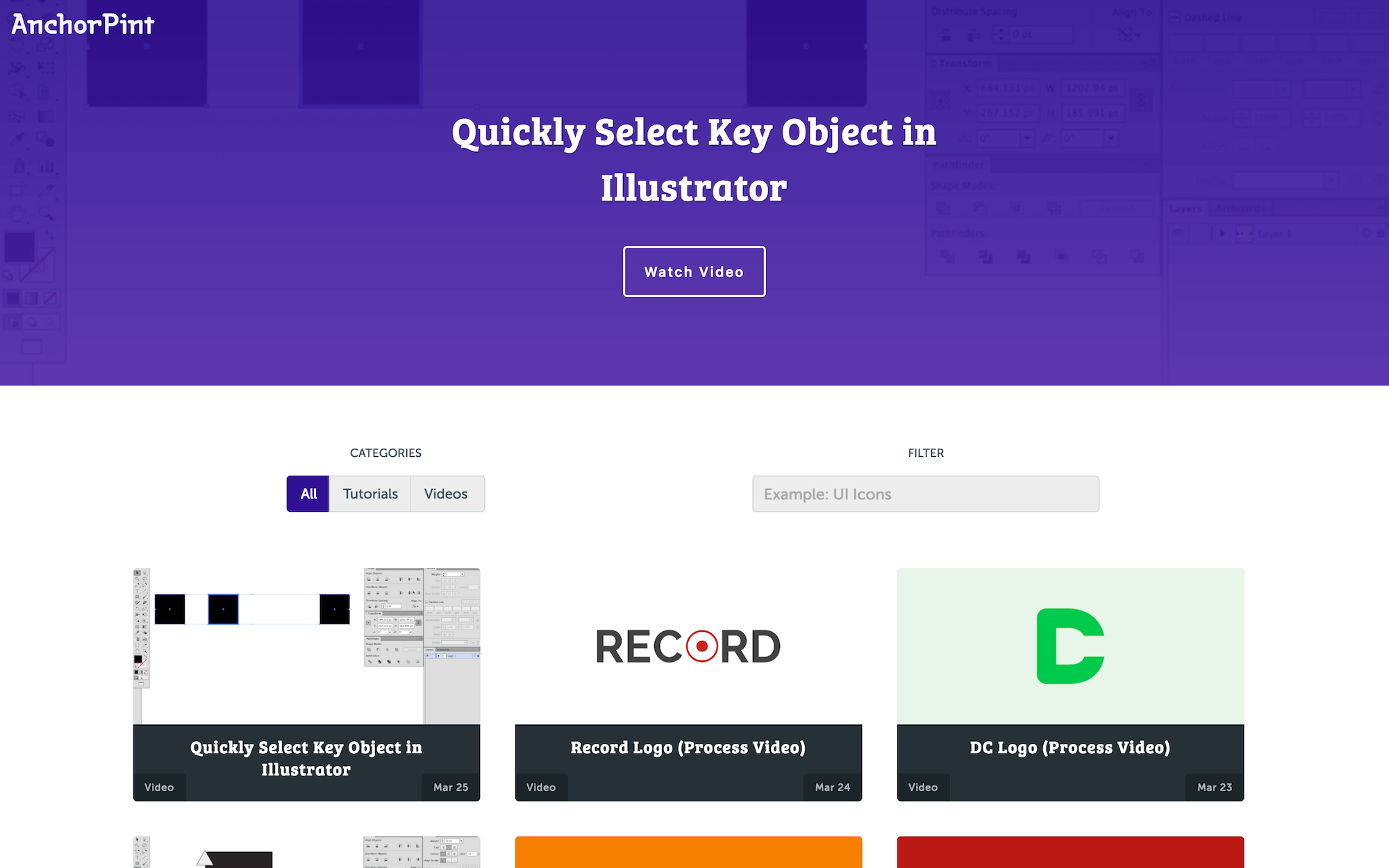
The AnchorPint home page, with hero section content and filter section allowing users to easily sort and search content.
The Challenge
The biggest challenge of AnchorPint was creating the daily content for users. Each day, we posted a new video - some of which were full-length design tutorials, others time-lapse screencast videos showing our design process, and others were quick tips for Adobe Illustrator users. The YouTube channel is still live.
The Result
Ultimately, work on AnchorPint was shelved. With the daily content requirements, along with resource creation for the shop, coupled with regular client work, it was just too much at the time. Who knows, maybe someday it will be resurrected :)
